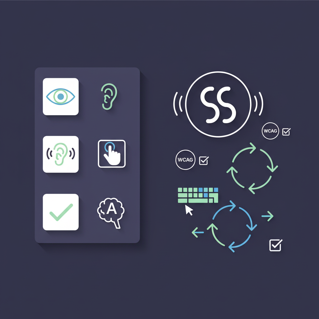
WCAG 2.2: What's New and Why Your Website Needs to Comply
The Web Content Accessibility Guidelines version 2.2 became an official W3C Recommendation in October 2023. If you haven't updated your accessibility practices since WCAG 2.1, there are nine new success criteria you need to know about — and some of them are more disruptive than they might initially appear.
This guide covers every new criterion in plain English, explains who needs to comply and by when, and gives you a practical sense of what "passing" actually looks like in code.
Why WCAG 2.2 Matters Now
WCAG 2.2 isn't just an academic update. It has real legal weight:
- The UK's Public Sector Bodies Accessibility Regulations reference WCAG as the compliance standard, and government guidance is expected to update to 2.2.
- The EU's European Accessibility Act (EAA), enforceable from June 2025, maps to EN 301 549, which in turn references WCAG 2.1 AA — and will follow WCAG updates.
- The US Department of Justice's 2024 rulemaking for Title II ADA explicitly cites WCAG 2.1 AA, but litigation trends suggest courts are increasingly receptive to 2.2 arguments.
- Private sector accessibility auditors and procurement teams are already demanding WCAG 2.2 compliance.
In short: even where 2.2 isn't yet legally mandated, it's where the industry is heading. Getting ahead of it now costs a fraction of retrofitting later.
What Changed Between WCAG 2.1 and 2.2
WCAG 2.2 added nine new success criteria and removed one (4.1.1 Parsing, which is now considered redundant given how browsers handle malformed HTML). The new criteria are spread across Level A and Level AA, with one at Level AAA.
Here's the full breakdown.
The 9 New Success Criteria
1. 2.4.11 — Focus Not Obscured (Minimum) [Level AA]
What it means: When a user interface component receives keyboard focus, the component is not entirely hidden by author-created content — for example, a sticky header, cookie banner, or chat widget sitting at the bottom of the screen.
Why it matters: Keyboard users navigate by tabbing through interactive elements. If a focused element is completely covered by a sticky footer or modal overlay, the user has no visual feedback about where they are on the page. This is a significant barrier for people who can't use a mouse.
What "passing" looks like:
- The focused element must not be entirely hidden — partial obscurement is allowed at minimum level (2.4.12, below, tightens this to not partially obscured)
- If you have a sticky navigation bar, ensure your scroll-padding or scroll-margin CSS accounts for focus position
- Test by tabbing through your entire page with a sticky header active
Common failures:
- Cookie consent banners that cover the bottom of the viewport and hide focused buttons
- Chat widgets that overlap form fields
- Sticky footers that sit over navigation links
2. 2.4.12 — Focus Not Obscured (Enhanced) [Level AAA]
The stricter version of 2.4.11. At this level, the focused component must not be partially obscured — it must be fully visible when it receives focus.
This is Level AAA, so it's aspirational rather than mandatory for most compliance frameworks. But if you're building a service used by people with significant visual or cognitive impairments, it's worth targeting.
3. 2.4.13 — Focus Appearance [Level AA]
What it means: When a keyboard focus indicator is visible, it must meet minimum size and contrast requirements. Specifically:
- The focus indicator must have an area of at least the perimeter of the unfocused component multiplied by 2 CSS pixels
- The colour change must have a contrast ratio of at least 3:1 between the focused and unfocused states
Why it matters: Many websites remove the default browser focus ring (outline: none) and replace it with nothing, or with a barely-visible custom indicator. This leaves keyboard users with no reliable way to see where they are on the page.
What "passing" looks like:
- A solid 2px outline around a button with sufficient contrast is a reliable baseline
- Don't remove
outline: noneunless you're replacing it with something equally or more visible - Use your browser's built-in focus styles as a minimum, then enhance from there
Common failures:
* { outline: none; }in your global CSS with no replacement- Light grey focus rings on white backgrounds
- Focus indicators that are only 1px wide
4. 2.5.7 — Dragging Movements [Level AA]
What it means: Any functionality that uses a dragging movement (like sliders, drag-and-drop interfaces, or map panning) must also be operable with a single pointer without dragging.
Why it matters: Dragging requires sustained contact with the screen or mouse button while moving. This is difficult or impossible for people with motor impairments, tremors, or who use certain assistive technologies.
What "passing" looks like:
- A range slider must also have increment/decrement buttons, or be controllable via keyboard
- A Kanban board with drag-and-drop must offer a menu-based alternative (e.g. "Move to Done" option)
- A map that pans by dragging must also have pan buttons or keyboard controls
Common failures:
- Sliders with no keyboard alternative
- Calendar appointment creation by dragging with no click-based alternative
- File organisation interfaces that only support drag-and-drop
5. 2.5.8 — Target Size (Minimum) [Level AA]
What it means: The size of pointer input targets (buttons, links, checkboxes, etc.) must be at least 24 by 24 CSS pixels, with some exceptions.
Why it matters: Small touch targets are a significant barrier for people with motor impairments, those using touchscreens, and anyone with reduced fine motor control. The previous guidance (2.5.5, Level AAA) recommended 44×44px — this new criterion sets a more achievable 24×24px minimum at Level AA.
What "passing" looks like:
- A 16px icon button surrounded by at least 4px of spacing on each side (making the total offset area 24×24px)
- Inline text links are exempt when inline (changing their size would disrupt text flow)
- The criterion measures the target offset area, not just the visible component — so padding counts
Common failures:
- Social media icon buttons that are 16×16px with no padding
- Small checkbox and radio button inputs
- Tightly packed navigation links with no spacing between them
6. 3.2.6 — Consistent Help [Level A]
What it means: If a website provides a mechanism for help — such as a contact form, phone number, live chat, or FAQ link — it must appear in a consistent location across all pages.
Why it matters: People with cognitive disabilities often need help completing tasks. If help options appear in different places on different pages, users have to rediscover them every time.
What "passing" looks like:
- Your "Contact Support" link is always in the footer, or always in the header navigation
- Live chat widgets appear in the same corner on every page
- Help mechanisms don't move around between page sections
Common failures:
- Contact links that appear in the footer on the homepage but in the sidebar on product pages
- Help content that only appears on certain page templates
7. 3.3.7 — Redundant Entry [Level A]
What it means: Information already entered by a user in a multi-step process must not be asked for again in the same session, unless re-entering it is essential or the information needs to be confirmed.
Why it matters: Asking users to re-enter the same information (like their email address or billing address) is a burden for everyone, but it's especially problematic for people with cognitive impairments, memory difficulties, or motor impairments where typing is laborious.
What "passing" looks like:
- During checkout, if a user enters their email in step 1, it's pre-filled in step 3
- Shipping address is offered as the default billing address
- Form fields are pre-populated from earlier answers in a wizard
Common failures:
- Registration flows that ask for email at the start and then ask for it again to confirm on a later screen (confirmation is allowed, but the field should be pre-populated)
- Multi-step forms that restart from scratch if the user goes back
8. 3.3.8 — Accessible Authentication (Minimum) [Level AA]
What it means: A cognitive function test — such as remembering a password, solving a puzzle, or transcribing text — cannot be required for any step of an authentication process unless an alternative is provided, or the test involves recognising an object or personal content provided by the user.
Why it matters: People with cognitive disabilities, dyslexia, or memory impairments find traditional password-based authentication genuinely difficult. CAPTCHAs that require interpreting distorted text are often impossible for people with visual or cognitive impairments.
What "passing" looks like:
- Allow password managers (don't block paste into password fields)
- Provide email magic links or single-use codes as an alternative to passwords
- Use image-based CAPTCHAs where the user identifies objects (not distorted text)
- Offer biometric authentication options
Common failures:
input[type="password"] { -webkit-user-select: none; }preventing paste- Requiring users to memorise and re-enter a specific string from earlier in the process
- Text-based CAPTCHAs with no audio alternative
9. 3.3.9 — Accessible Authentication (Enhanced) [Level AAA]
The stricter version — no cognitive function tests whatsoever in authentication, including object recognition. Again, Level AAA, so aspirational rather than mandatory for most frameworks.
Who Needs to Comply and By When
Public sector organisations (UK and EU)
UK public sector bodies are required to meet WCAG 2.1 AA under the Public Sector Bodies Accessibility Regulations. The government's accessibility monitoring programme will migrate to WCAG 2.2 — check GDS guidance for the current timeline.
EU public sector bodies fall under the Web Accessibility Directive (WAD), which also references EN 301 549 and WCAG 2.1 AA. Updates to EN 301 549 to incorporate WCAG 2.2 are in progress.
Private sector (EU)
The European Accessibility Act becomes enforceable in June 2025 and applies to a wide range of private sector services. It currently references WCAG 2.1, but the underlying standard (EN 301 549) is expected to update.
Private sector (US)
The DOJ's 2024 Title II rulemaking mandates WCAG 2.1 AA for state and local government websites. Title III guidance for private businesses is evolving, but litigation risk is real regardless of formal mandates — and courts have accepted WCAG 2.2 arguments.
The practical answer
If you're building or auditing a website today, aim for WCAG 2.2 AA. It's where compliance is heading, it's achievable, and it's demonstrably better for users.
How to Audit Your Site for WCAG 2.2
The new criteria require both automated and manual testing:
- Focus Not Obscured (2.4.11): Tab through your site with sticky elements active. Visual inspection required — no automated tool catches this reliably.
- Focus Appearance (2.4.13): Check your focus styles in DevTools. Use a contrast analyser on your focus indicator colours.
- Dragging Movements (2.5.7): Identify every drag interaction. Test each for a single-pointer alternative.
- Target Size (2.5.8): Some automated tools can flag small targets. Verify manually with browser DevTools ruler.
- Consistent Help (3.2.6): Compare help mechanism placement across page templates.
- Redundant Entry (3.3.7): Walk through every multi-step form in your site.
- Accessible Authentication (3.3.8): Test your login flows. Try pasting into password fields. Check your CAPTCHA implementation.
WCAGCheck's automated scanner tests for the criteria that can be reliably detected programmatically, and flags issues for manual review where human judgement is required.
The Bottom Line
WCAG 2.2 isn't a radical departure from 2.1 — most of the changes are refinements that address real friction points for disabled users. The new criteria around focus visibility, target size, authentication, and dragging movements reflect how the web has actually evolved since 2.1 was published in 2018.
The organisations that will struggle are those treating accessibility as a checkbox exercise rather than a design principle. If you're building with keyboard users, screen reader users, and people with motor or cognitive impairments in mind, most of these criteria will feel like good practice rather than new requirements.
Start with a thorough audit, prioritise the Level A and AA criteria, and fix issues in order of severity. If you haven't done an accessibility review recently, now is the right time.